A Practical Cheat Sheet for CSS Flexbox (Containers)
Level up your Flexbox skills with this visual guide


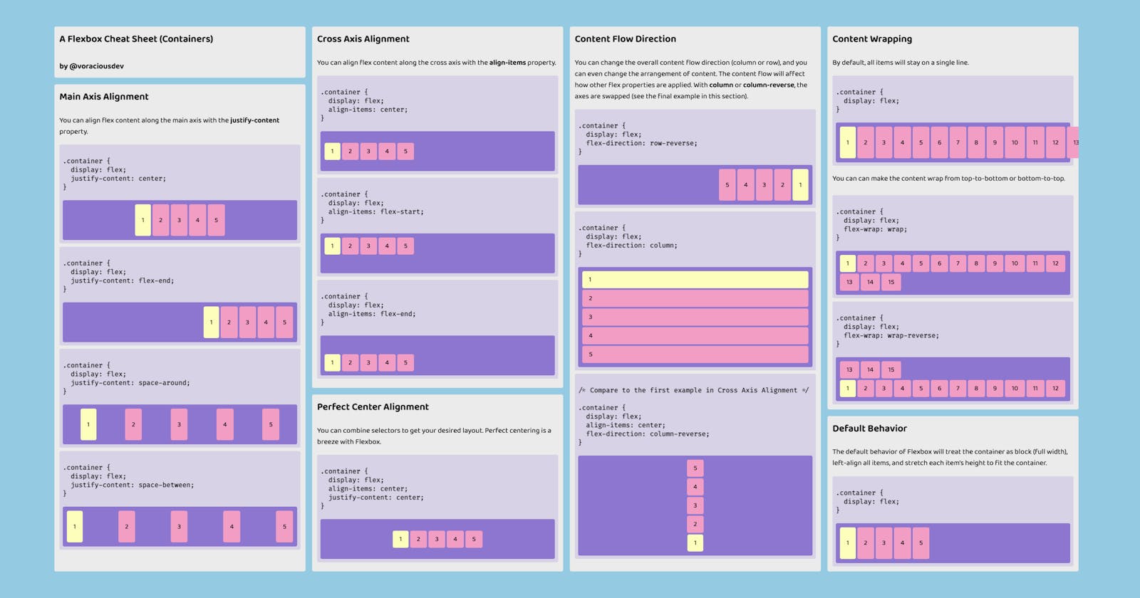
I originally posted this Flexbox cheat sheet on Twitter, but the response was so positive that I decided to write it up here too! We will cover the (in my opinion) most common scenarios for Flexbox.
If you just want the cheat sheet (pictured above), you can download it here!
Table of Contents
- Horizontal Alignment
- Vertical Alignment
- Perfect (Vertical and Horizontal) Center Alignment
- Content Direction
- Content Wrapping
- Default Behavior
Horizontal Alignment
You can align items horizontally as a group or individually.
Anchor group to the center (horizontally)
.container {
  display: flex;
  justify-content: center;
}

Anchor group to the right side
.container {
  display: flex;
  justify-content: flex-end;
}

Add space around all items
.container {
  display: flex;
  justify-content: space-around;
}

Add space between all items
.container {
  display: flex;
  justify-content: space-between;
}

Vertical Alignment
You can align items vertically as a group.
Anchor group to the center (vertically)
.container {
  display: flex;
  align-items: center;
}

Anchor group to the top
.container {
  display: flex;
  align-items: flex-start;
}

Anchor group to the bottom
.container {
  display: flex;
  align-items: flex-end;
}

Perfect (Vertical and Horizontal) Center Alignment
You can combine selectors to get your desired layout. Perfect centering is a breeze with Flexbox.
.container {
  display: flex;
  align-items: center;
  justify-content: center;
}

Content Direction
You can change the overall content flow (column or row), and you can even change the arrangement of content.
Reverse the flow of content (horizontally)
.container {
  display: flex;
  flex-direction: row-reverse;
}

Flow content vertically instead of horizontally
.container {
  display: flex;
  flex-direction: column;
}

Reverse the flow of content (vertically)
.container {
  display: flex;
  flex-direction: column-reverse;
}

Content Wrapping
By default, all items are put on a single line.
.container {
  display: flex;
}

Wrap content to next lines (flow down)
.container {
  display: flex;
  flex-wrap: wrap;
}

Wrap content to previous lines (flow up)
.container {
  display: flex;
  flex-wrap: wrap-reverse;
}

Default Behavior
The default behavior of Flexbox will...
- Treat the container as block (full width)
- Left align all items
- Stretch each item's height to fit the container
- Fit all items on a single line
.container {
  display: flex;
}

Thanks for taking the time to check this out! If you think something is missing or you just want to say hello, please leave a comment below! ✌️